The Photobiology of Mood: Yellow vs. Blue
When designing spaces for children, we naturally think about physical safety, accessibility, and interactive materials. But there is a silent partner in the room that shifts behavior before a child ever picks up a single toy: the color palette. Visual stimuli act as direct lines to a child's neurological framework, fundamentally shifting mood, energy levels, and their capacity to focus.
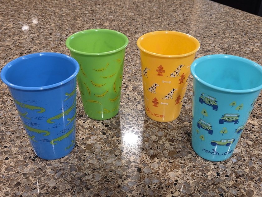
A Confession from the Kitchen Counter
Ever since my son was little, I’ve harbored this hyper-specific, slightly unhinged theory: the color of the plastic cup I hand him with breakfast dictates his entire day.
If he gets the blue, green, or turquoise cup, our morning runs smoothly. If I hand him the bright yellow cup, I immediately brace myself. For years, I noticed he seemed far more frustration-prone on the days yellow entered the morning routine.
I used to laugh it off as just a weird parenting superstition or an over-analytical quirk. But as I began deep-diving into environmental design and how developing brains process sensory stimuli, I discovered something fascinating: my gut wasn’t playing tricks on me. There is genuine, hard science behind the cup.
The Science of the “Yellow Cup Day”
Human eyes process different colors through varying electromagnetic wavelengths, each triggering distinct biochemical pathways within the brain's endocrine and nervous systems. Because children’s sensory systems are still actively developing, they are far more sensitive to these environmental triggers than adults.
Yellow: The High-Velocity Spark
Evolutionarily, yellow is our physiological wake-up call. It mimics the high-noon sun, signaling alertness, energy, and rapid cognitive activity.
In a dynamic play environment, accents of yellow are fantastic for sparking creativity, enthusiasm, and rapid problem-solving. However, because it is a massive sensory stimulant, the line between inspired and over-stimulated is incredibly thin.
If a child begins their morning running on a high baseline of emotional energy, introducing a heavy yellow stimulus can accidentally push them into sensory overload. Cognitive fatigue sets in quickly under intense, sustained yellow exposure, manifesting as irritability, low frustration tolerance, and behavioral meltdowns. It turns out the "yellow cup day" is simply a case of a sensitive nervous system being pushed past its regulatory threshold before 8:00 AM.
Blue, Green, and Turquoise: The Neurological Regulators
On the opposite end of the visible light spectrum lie blues and greens. Exposure to these cool tones has been clinically shown to reduce ambient stress, drop resting heart rates, slow respiration, and lower blood pressure.
When a child interacts with a turquoise or blue object, it acts as a visual anchor. Turquoise beautifully combines the tranquility of blue with the grounding, stabilizing qualities of green. This color combination actively dampens cortisol production (the stress hormone).
In a play or learning setting, these shades allow a child to slow down, transition from erratic movement to deep immersion, and build resilience when an open-ended puzzle or engineering challenge doesn't work out on the first try.

Designing Visual Ergonomics into Play Spaces
Because colors pull these powerful physiological levers, building a successful family entertainment or play space requires moving past the outdated, chaotic fast-food playground aesthetic. Saturating an entire room in loud, primary colors doesn't make it fun; it makes it a sensory minefield.
Instead, we treat a play space through the lens of visual ergonomics: intentionally matching color profiles to specific behavioral goals. To achieve this without overwhelming the senses, professional designers rely on a precise spatial formula: The 60-30-10 Environmental Rule.
Rather than a chaotic free-for-all, the visual field is distributed mathematically to establish visual harmony and clear behavioral zones:
60% Grounding Neutrals (The Foundation): The foundational base of a room (floors, major architecture, and primary structural walls) should utilize natural wood tones, muted sands, or soft grays. This large surface area neutralizes visual noise, stabilizes sensory intake, and prevents a child's brain from entering a chronic state of scanning defense.
30% Calming Cool Tones (The Regulators): Medium-scale elements like zoning dividers, rugs, and large loose-parts containers should carry soothing blues, sage greens, or balanced turquoises. This keeps a child’s baseline emotional state grounded and resilient. These tones are mapped directly to independent play zones, reading nooks, and intricate building stations where focus and self-regulation are key.
10% Stimulating Accent Colors (The Sparks): High-stimulus colors like vibrant yellow, coral, or warm orange are reserved exclusively for targeted interaction points. Think of it as a visual exclamation point: we use it to highlight an interesting tool, an active movement zone, or a unique artistic prompt that encourages shared group dynamics.
The STEAM Takeaway
By treating color as a functional tool rather than an afterthought, we transform four walls into an active partner in child development. A thoughtfully balanced visual field allows kids to expend their energy on authentic movement and engineering challenges, rather than wasting precious cognitive reserves trying to tune out environmental noise.
So, if you find yourself staring at your kitchen cabinet in the morning, wondering if choosing the turquoise cup over the yellow one is just a strange parenting quirk, trust your instincts. You are not being superstitious; you are actively engineering your child's morning neurochemistry. And when it comes to setting up a day of successful, focused play, every single wavelength counts.